Interior design
2015
This private residence was built according to Emil Urbel's standard design as a functionalist two-storey building. The exterior finish was accentuated with thick cornices, while the window-high dark cladding with openings adds both structure and energy to the building's simple geometry. It is a compact and rational solution.
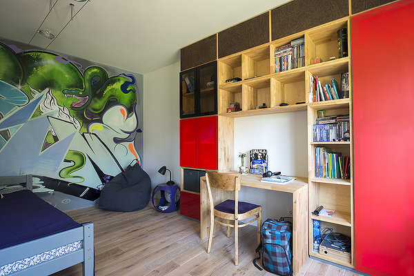
The family's wish and the priority in the task was to make the compact spaces more private and personalised for every member of the family. The children needed their own rooms, the parents wanted a more private bedroom with an ensuite and everyone wanted a bigger kitchen. All members of the family had different wishes, and we made no compromises. Our wish was to give everyone what they wanted. Thus one of the children's bedrooms has a piano and a picture on the wardrobe of Yoko Ono performing, while the other child's room has large-scale graffiti. The bathroom has a carved mirror and a bathtub with the legs of a lion – details that enrich the clean-cut, modern space. In addition, the family wanted to update the interior decoration. The biggest changes with spacial effects were as follows:
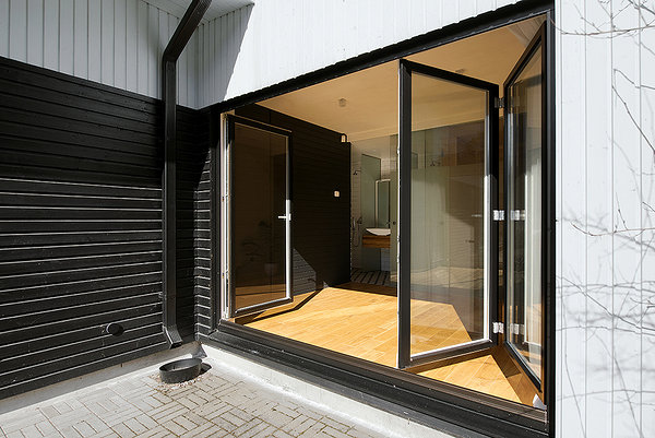
The sauna, bathroom and seating area were made more spacious. Since it was quite a compact space we decided to use a lot of glass to achieve as much of a visual connection between the rooms as possible. A small door was replaced with a folding door that enables the seating area and terrace to be turned into one room. To enhance this image, the same cladding was used on the seating area’s walls as on the facade.
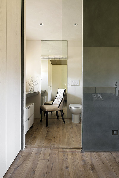
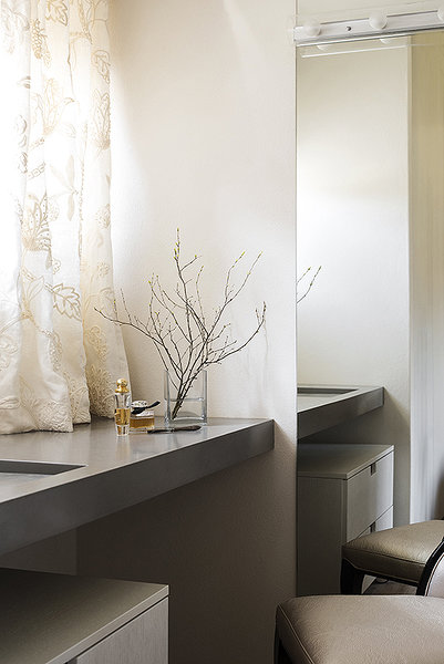
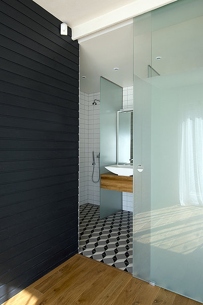
Joining the master bedroom and bathroom. Previously, the bathroom was accessible from the hallway and was used by all of the family members. Joining the bathroom with the main bedroom made the bathroom feel like a private boudoir. The location of the entrance and use of a glass door were favoured so that the evening sun could access the bedroom.
High doors. The existing 2.1-metre wood fibre doors were replaced with floor-to-ceiling 2.5-metre veneer doors. For this we required the help of a civil engineer, as the lintels had to be adjusted. A house with a wooden frame is quite easy to remodel. The high doors enhanced the rooms and added certain missing functional characteristics within the house.
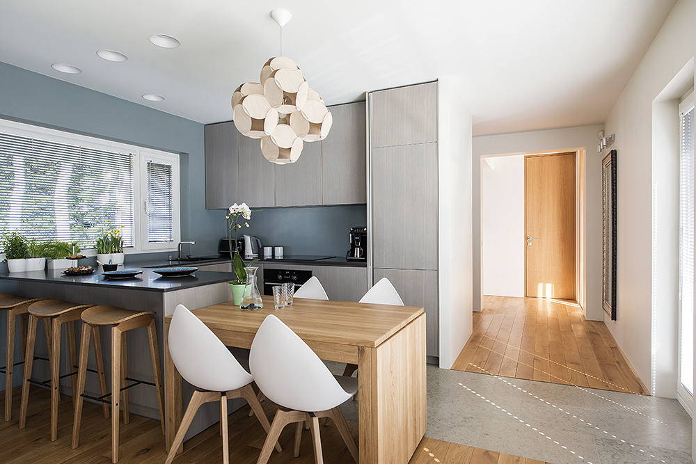
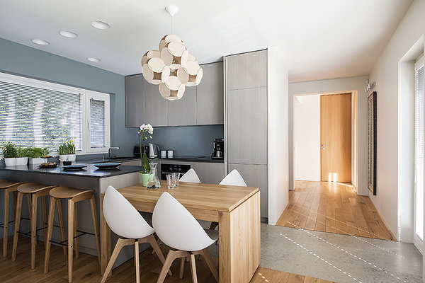
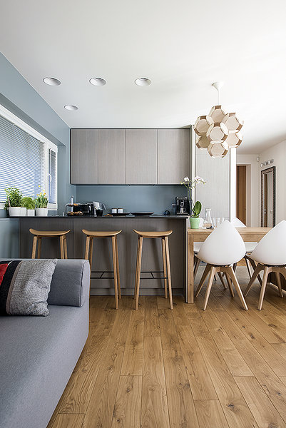
Redesigning the kitchen. Previously, the only surface in the kitchen was against the wall, with a kitchen table in the centre. This made the kitchen too imposing on the living room. Thus an island was planned in the kitchen which, with its minimalism, added a concrete finish and created the much-needed extra surface.
The furniture solution for the graffiti room was devised in cooperation with the boy who calls the room home. We provided a 360 x 360 mm module, which is a good depth and height for a bookcase. 2 x 360 is the height and depth of a desk or the width of a cupboard. The eventual layout was determined by the young man himself.
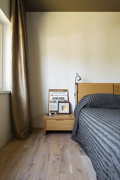
For materials we decided on natural and genuine characteristics so as to emphasise the inherent beauty of the materials. Thus we used a lot of natural-finish timber as well as limestone. We gave the walls some added texture by finishing them with lime plaster, and for the wall behind the bathtub we used puttying techniques to waterproof the surface.
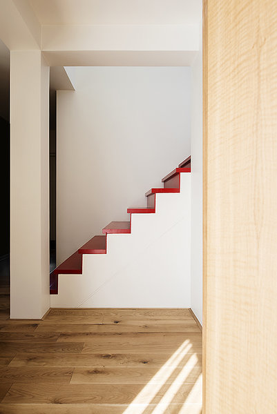
The author of the light box in the bathroom and the family portrait above the stairs is Maria Aua. The graffiti is by Uku Sepsivart.
Text: Eve Arpo
Photos: Terje Ugandi
